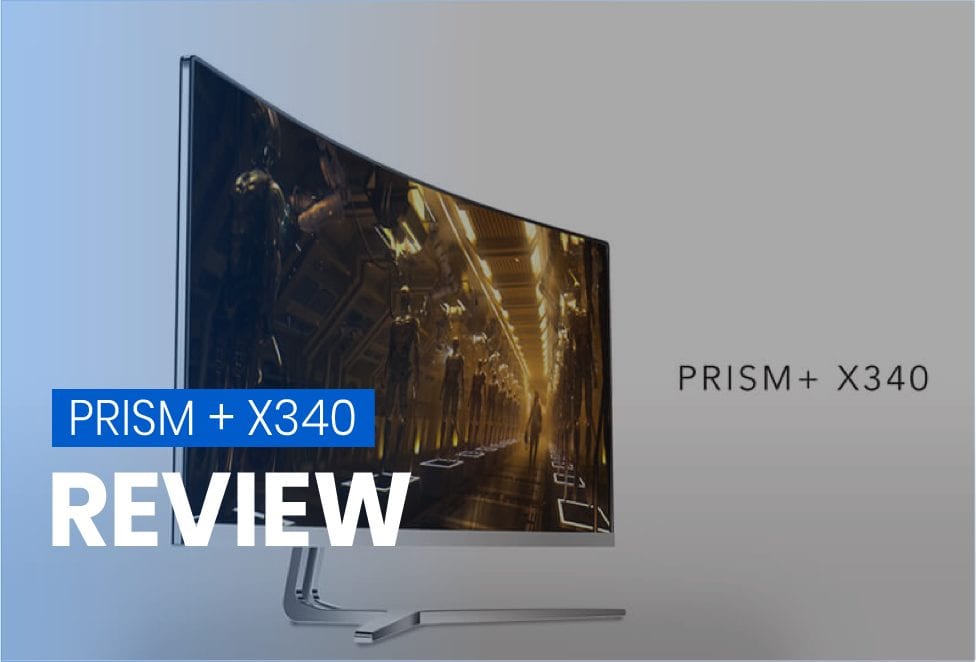
Monitors started as clunky squares, although there are still some square monitors being manufactured, with the proliferation of the 1920 x 1080 full HD format, we have transitioned to the era of the omnipresent 16:9 widescreen monitors, which most professionals use nowadays.
But some users desire and even more futuristic wide screen setup, either by setting up multiple monitors in an AMD Eyefinity or Nvidia Surround style setup. With gaming monitors, this setup is not particularly cheap, there are those distracting bezels in the way, and you have to use 3 power cords as well.
With a recent new line up of 21:9 aspect ratios, they proved to be excellent monitors for creative professionals in many different ways. Let’s take a look at one of such monitors, the PRISM+ X340, and the unique experience it brings for professionals.
The PRISM+ X340 is created by a Singapore Company, and is also the team which founded AfterShock, a company that produces professional custom gaming PC’s and laptops.
First impressions
It is time to immerse yourself with a whole new mesmerizing viewing experience with the PRISM+ X340 144Ghz Professional Gaming Monitor.
34” Screen size
It carries a massive 34” display which you can tell from its model name if you are well-versed with monitor models. The large display really helps when you are using the QHD resolution because we can fit a lot more screen real estate in.
When we first opened up the packaging, we were astonished by just how big 34” was. It was our first time getting a 34” monitor, and it was much bigger than our 27” monitor. In fact, it felt more like it was meant to be on the wall like a TV than on a desk like a computer monitor. This monitor spells minimalist and premium from top to bottom.
The setup was surprisingly easy, there were only 4 simple steps:
1. Screw the stand onto the monitor so it can stand.
2. Connect the power wire to the monitor.
3. Connect DP wire to your PC.
4. Turn on.
It worked like magic, and the huge monitor made me feel like I was living in the future of technology.
What’s more, it also delivers a wide color gamut and viewing angles while preserving a 3000:1 contrast ratio and comes with a 4ms response time.
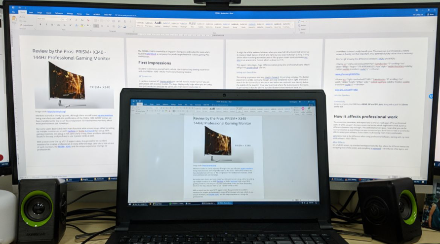
Here’s how it looks like with a 15” Aftershock 15 laptop as a reference.
Beautiful Curves
Unlike your traditional monitors, this beauty has fantastic curves as well, which really helps to envelope you with a natural field of vision, creating a mind blowing cinematic viewing experience.
21:9 Aspect Ratio
Unlike traditional monitors, because of its 21:9 ultrawide aspect ratio (sometimes called super widescreen), this monitor allows you to have a larger peripheral vision so you can see and do much more on your screen.
It might be a little awkward at times when you view Full HD videos in full screen as it creates 2 black bars on the left and right, but you stop realizing it quickly. It truly shines when watching movies because it fills up your screen as most movies are shot in an anamorphic format, which is closer to 21:9.
This aspect ratio plays a huge difference when going into professional work, which I will go into greater detail later on.
Setting up & Ease of Use
The setting up process was very straightforward, it’s just plug and play. The button placement is a little confusing though, as it was completely out of sight. We had to search for the buttons for a minute or two before we realized it was directly below the middle of the monitor. Once you found out where the buttons were, the rest is as per normal. It has the same 4 standard buttons most monitors have: on, previous, next, and menu.
Resolutions and Refresh Rate
It comes with 2 resolutions. At 2560 x 1080, which is basically a wider Full HD display, it runs at 144Hz. At 3440×1440, which is basically a wider Quad-HD, or WQHD for short, it is about 1.5x the resolution of Full HD and it runs at 100Hz.
Most standard entry-level monitors run at 60Hz, and this means your monitor displays 60 images per second, and when your monitor refreshes at 144Hz a second, it displays 144 images per second, meaning everything is as smooth as butter and it feels closer to real-life.
Even day to day tasks like scrolling through websites and multi-tasking, you can distinctively feel the difference of a 100Hz screen. It’s the combination of the fluidity and responsiveness that just makes it feels better to look at. It’s one of those things that you have to see yourself to fully grasp it.
When it comes to gaming, that’s where having a higher refresh rate really makes a difference to be able to react faster, but since this post is meant for professionals, I won’t go into the gaming details.
The 21:9 aspect ratio certainly do make games a lot more immersive and cinematic, great for a well-deserved break after a long day of hard work.
So how does this affect you as a professional? Not so much really. Apart from having a snappier time with your software, most of your professional work do not require such high refresh rates, unless you are editing videos above 60 FPS. But even then, it doesn’t really benefit you. This means as a professional, a 100Hz screen is frankly not that important. It’s a definitely luxury rather than a necessity.
Here’s a gif showing the difference between 144Ghz and 60Ghz
Monitor Speakers (Discontinued)
This monitor comes with in-built speakers as well. The audio quality sounds pretty abysmal but still better than having none. It could come in handy for professionals as a back-up in case their speakers are spoilt.
I was just informed that there is no more in-built speakers for the current and future batch of monitors.
Connectivity
In terms of ports, the X340 has a HDMI, DP and DVI port, along with a jack for 3.5mm audio out.
How it affects professional work
The screen size, resolution, and aspect ratio is where it really pays off for professional work. At QHD, you get 1.5x more screen real estate, which might seem small, but it’s a difference between day and night. This additional screen space means that you can be more productive as everything in on your screen and you don’t have to hide or scroll to be able to access your software. It also makes multi-tasking much more comfortable.
Let’s take a look at the difference when using professional software, starting with my most used software – After Effects.
After Effects
If you are into 2D animation, this is a huge game changer for you.
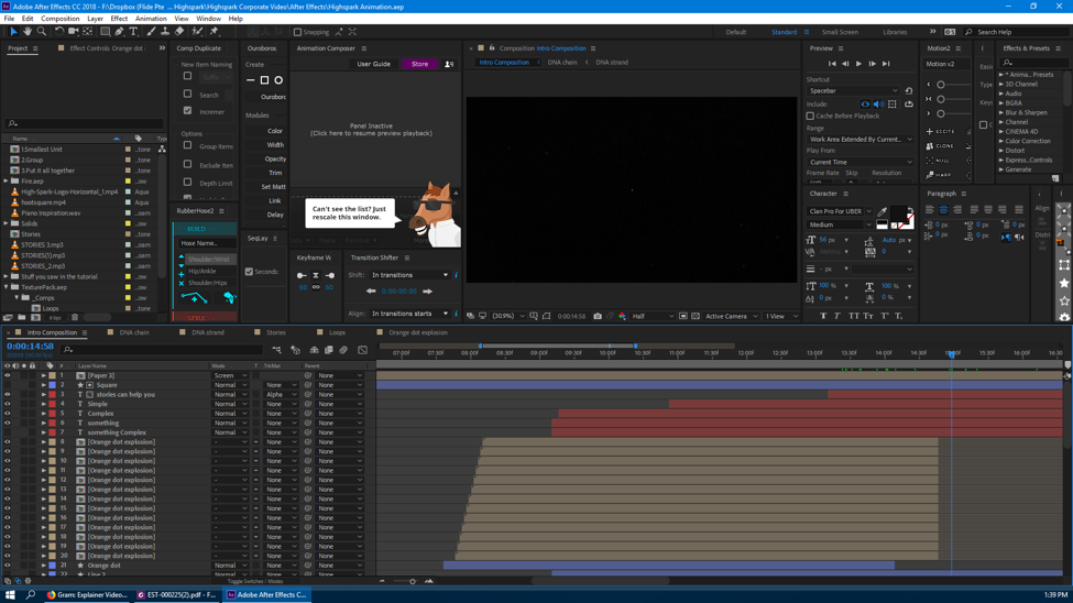
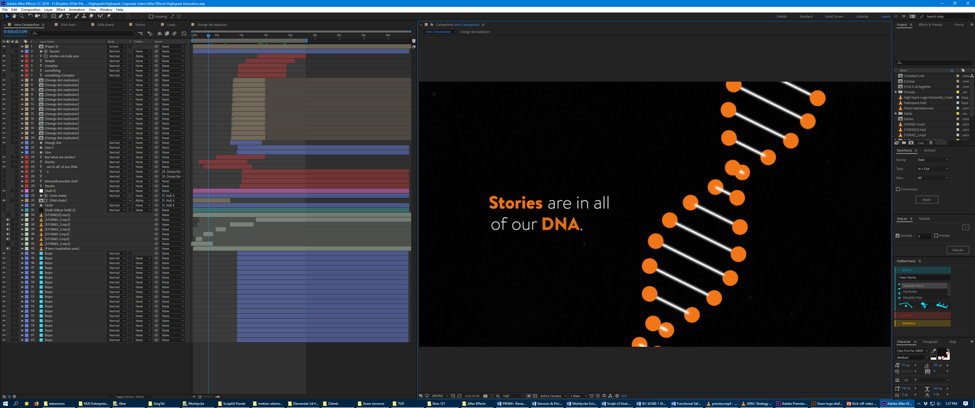
On a Full HD screen, my standard workspace looks like this, where the different menus are occupying most of the screen, and everything is squeezed. I can only see a few layers, and the view of the canvas is tiny. You can even see Mister Horse at the corner trying to tell you to rescale your window and subtly throwing some shade at you to get a bigger screen.
Now let’s take a look at it with the QHD screen. We are able to include a lot more menus, and you can see a whole lot more layers and a much larger canvas size. The most important factor is being able to see a much longer timeline. This means you don’t have to spend so much time scrubbing the timeline to see your keyframes and spend your time animating instead. The boost in productivity in After Effects alone makes it worth it already for animators.
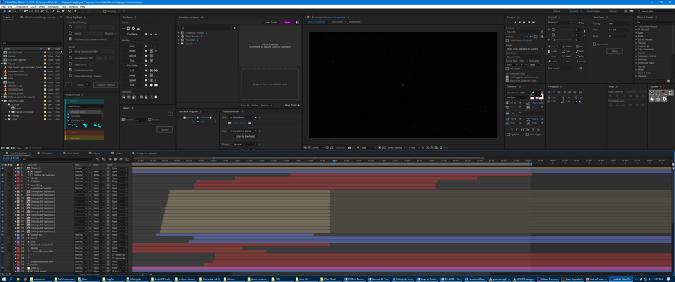
If I want to, I can also configure my workspace to cater to showing the most number of layers, which may be better for animating characters, and I can still fit most of my plugins.
Illustrator
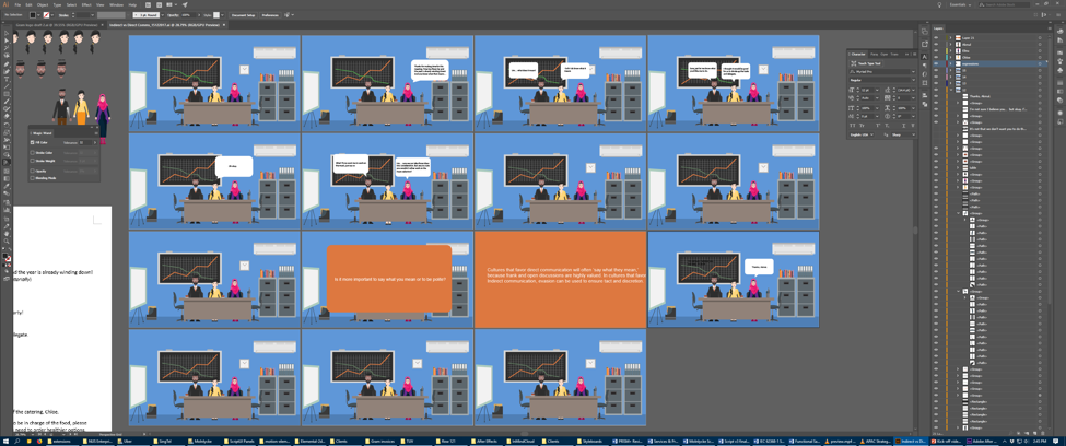
For artists and illustrators, it allows you to work with multiple artboards and allows you to look at much more layers in a single glance as well.
Premiere Pro
Editing a corporate video production is much easier with the PRISM+ as well.
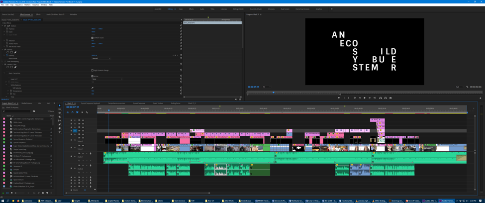
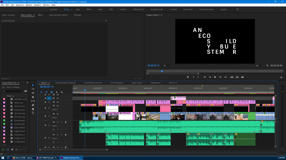
For videomakers, working on Premiere Pro gives me a lot more space in the timeline as well, making edits a lot easier. You will also be able to edit a longer list of effects.
Some of us may work on an anamorphic format with a ratio similar to 2.40:1. You’ll be glad to know that’s a very similar aspect ratio to the monitor as well coming close at 2.33:1.
This is how it looks like:
QHD:
FHD:
Coding
In terms of coding, it makes looking at lines of code easier as they have lesser line breaks. This means it’s easier to read and spot your code for mistakes, and the coding experience is overall neater and more pleasant.
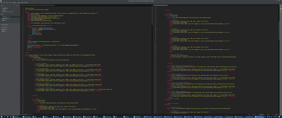
When on a full HD screen, you can see that longer lines of code will not be shown on a single line and that can make it harder to spot for mistakes during the review process.
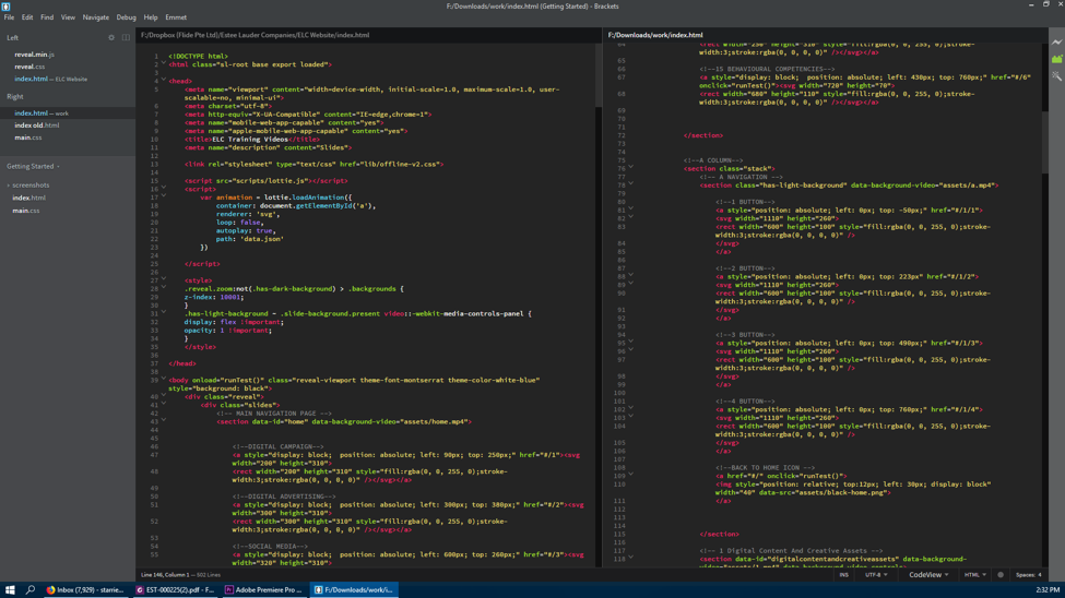
Editing documents
What about something common like editing documents? It’s a staple in everyday work, so you want to be sure you spend your time more efficiently on it, and the PRISM+ helps with that too.
Here’s how this article looks like being edited on a Full HD screen. You see the familiar 2-column layout, but you can’t really fit an entire page into it.
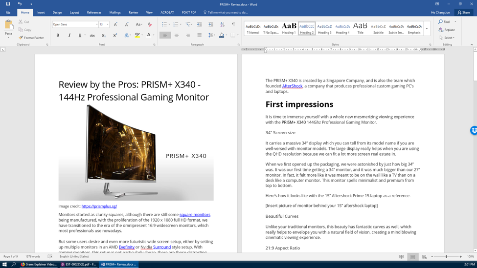
You can try to make it into a 3-column layout but the text becomes rather small.
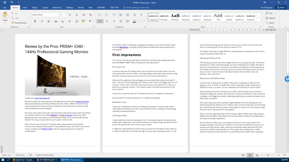
On the PRISM+, you can use a 3-column layout with ease, and can still see an entire page. Edits and reviews become much easier this way.
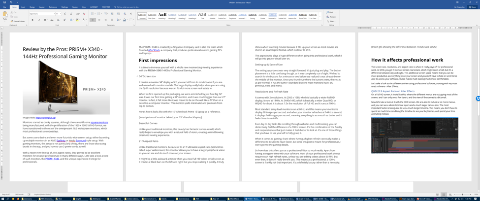
For those serious multi-taskers, you can also view it with 4-columns, although the text gets a bit too small for me, appearing more like a font size 8 even though it is font size 11.
PowerPoint
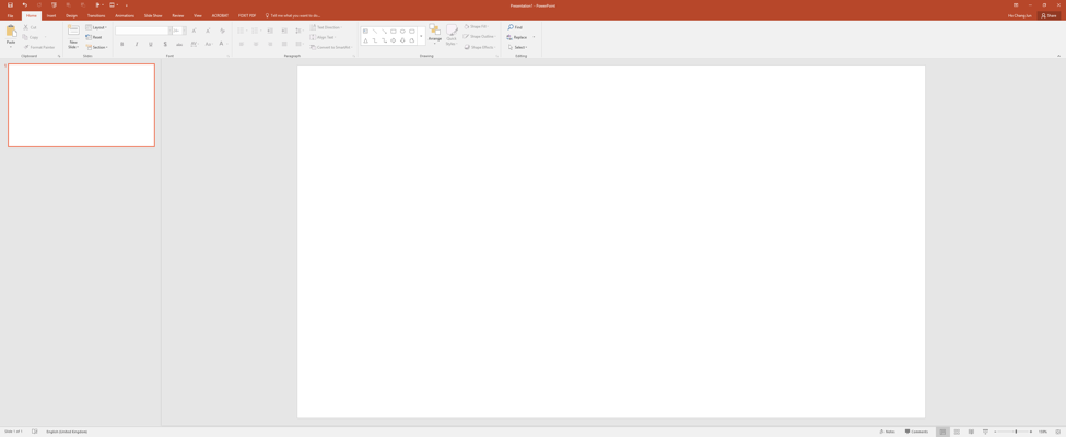
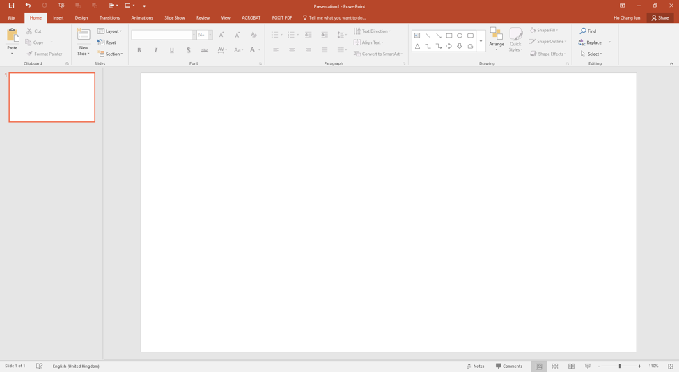
In case you’re wondering, for PowerPoint presentation, the experience is about the same.
Here’s a picture comparison for PowerPoint.
QHD:
Full HD:
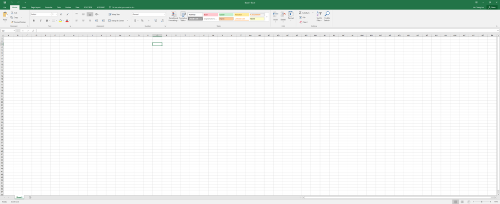
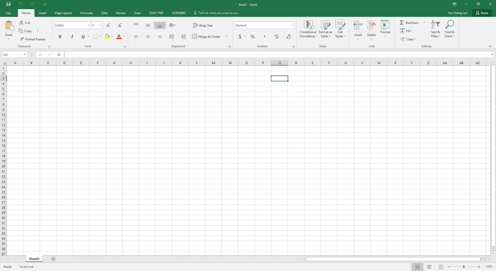
If you are a regular excel user, a 1.5x increase in size can make quite a big difference to your productivity especially if you are working on a big document. You are able to see much more data and diagrams.
Here’s a side by example:
QHD:
FHD:
Is it value for money?
If you are a professional freelancer, you probably want to know if this upgrade is worth the money comparing to other similar monitors.
Well you’ll be glad to know that for other 21:9 34” QHD monitors, the PRISM+ X340 has an incredibly competitive pricing at a promotional price of S$850 – S$899 (usual price of $1288).
If you compare it to the popular ASUS ROG Swift Curved PG348Q which goes for around a staggering S$2000, you can see how competitive it is priced. The Acer Predator X34 and BenQ XR3501 are going for around S$1300 and S$1000 respectively as well, which are options that are still more expensive.
If the price point is too steep, there are other models that PRISM+ offers, the W270 is a 27” monitor that also offers QHD and a standard 16:9 ratio, and it’s currently only at $375, less than half the price of the PRISM+ X340.
It’s always nice supporting a Singaporean company, especially one that truly makes great products at a competitive price, so if you are interested in having one, you can visit their product page here.
Overall thoughts on the PRISM+ X340
I have been using this monitor for about 3 months now, and it’s been an absolute pleasure on my eyes working on this monitor so far. When I first bought it, I actually looked forward to going to my office every morning to work on this monitor. If you’re a boss, this is a fantastic gift for your employees as well to make work more exciting for them.
At such a competitive price point, if you’re a professional creative person, I would say it’s an investment in your business if you are looking to bring your productivity to the next level. You would be hard-pressed to find an offer that is better than this at the current moment.
Here’s a quick summary of the PRISM+ X340.
Pros:
– Easy to set up
– Large 34” display creates an immersive experience for both work and gaming
– Stylistic and minimalistic look that makes it look premium on any desk
– Welcome to QHD and never look back
– 100Hz display creates a smoother overall computer experience
– Good contrast and vibrant colors
– Greatly improves work productivity
– Competitive pricing
– In-built speakers
Cons:
– Buttons are hidden from sight
– No adjustable height and not rotatable (but ergonomically it fits most Asians)
– 21:9 aspect ratio create 2 black bars while watching 16:9 full-screen videos
– Occupies quite a large space, so make sure your desk is big enough
Feel free to check out our other posts like how to improve your YouTube SEO!

