Case Study: Uber
Uber launches new services.
Once upon a client…
Uber approached us to create a 3-part onboarding video to announce their collaboration with Comfortdelgro and also educate audiences about their new services: UberFlash, UberCommute, and UberTaxi
The main objective:
Uber had a lot of content that they want to educate their audiences on, for example, the many different new processes that the Comfort delgro drivers have to learn in order to use the Uberflash service. There was a lot of information that we had to concise into short videos that have to be simple and seamless in educating the audience.
Additionally, they want the videos to be more engaging and easily understandable as compared to their competitors.
However, we ran into a few obstacles….
Their main target audience were middle-aged taxi drivers, and most of them could only speak Chinese. English was not their strong suit, so we had to create a Chinese translated version and also make sure the video was well explained and easy for them to understand.
Uber also did not provide us with the actual file of the app’s interface design, hence we had to recreate it from scratch to place it the videos.
How did we manage to do it?
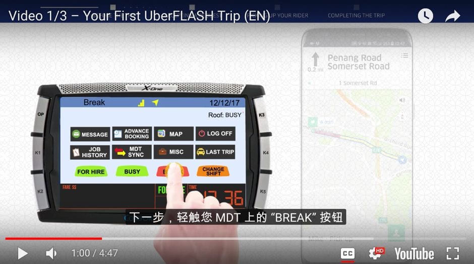
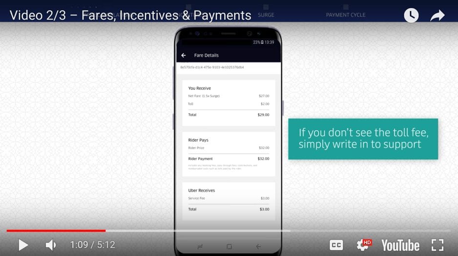
We started off by breaking down the information given to us into clear points that are easy to understand. We trimmed down the huge chunks of information and simplified it to explain the process step-by-step. Our first video was to teach the UberFlash drivers how to accept and complete a trip, contact their rider, and process payments. They also learn where to get support if they need help.
We also included a visual demo of how to go through the process with the MDT, making it easier to understand the process of using UberFlash.


The end result was…
A 3-part video series along with a 2 minute walk-through video on how to use the app. We garnered around 25,000 total views for these videos and our client was very satisfied with the results.


